Here’s a question: When was the last time you pulled out your laptop to check a website while standing in line at Starbucks?
Probably never, right? You grabbed your phone like everyone else.
Your potential clients are doing the same thing. They’re researching accounting firms between meetings. They’re vetting interior designers while waiting for their kid’s piano lesson to end. They’re comparing legal services from their phone while commuting on the GO train.
And if your website doesn’t work perfectly on mobile? They’re moving on to the next option before you even knew they were there.
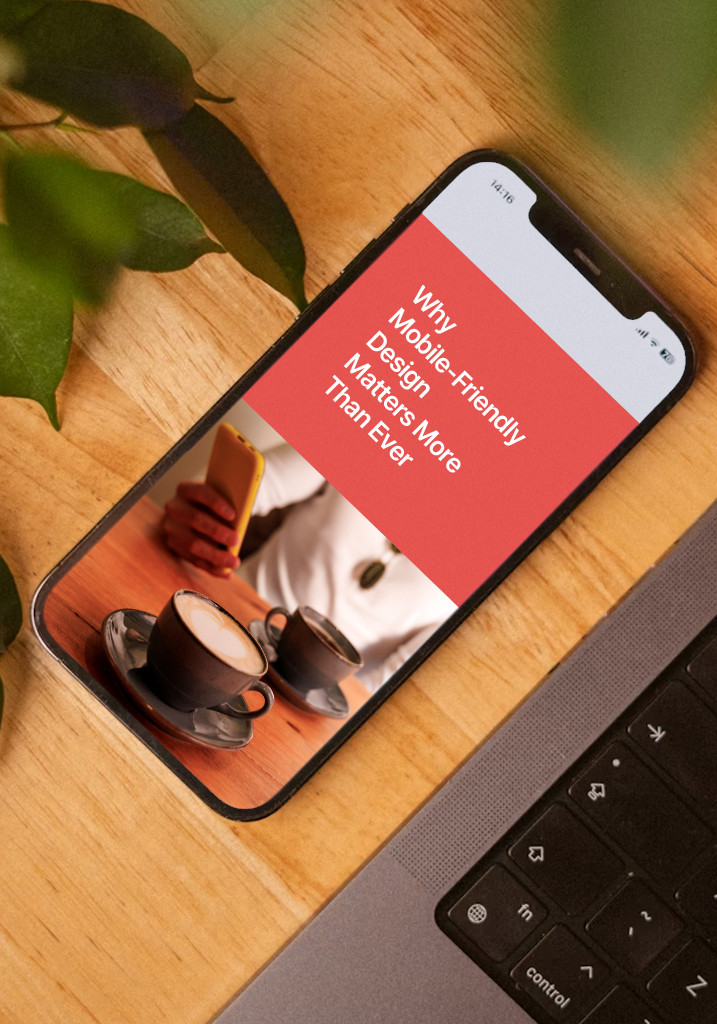
Let’s talk about why mobile-friendly design isn’t just a nice-to-have anymore, it’s the baseline expectation for any professional services firm that wants to be taken seriously.
The Numbers Don't Lie (But They Might Surprise You)
Nearly 65% of all website traffic now comes from mobile devices. Not desktop. Not tablets. Phones.
Think about what that means for your business. If you’re a financial advisor, more than half the people checking out your services are doing it from a device that fits in their pocket. If you’re an architect, prospects are reviewing your portfolio on a screen the size of their hand.
And here’s the kicker: Mobile usage isn’t just high, it’s been the dominant force since 2020 and continues to grow. This isn’t a trend. This is how people use the internet now.
For service professionals in the GTA, this matters even more. Your potential clients are busy. They’re researching you during stolen moments throughout their day, not sitting at a desk with time to wait for a clunky site to load or pinch-and-zoom to read your bio.
What Mobile Users Actually Expect (Hint: It's Not Patience)
Mobile users have zero tolerance for bad experiences. And by “zero,” I mean they’ll bail on your site faster than you can say “responsive design.”
The data is brutal: Mobile users expect pages to load in one to two seconds. If it takes longer than three seconds, more than half of them are gone. Not “frustrated and annoyed” – gone. Completely off your site, probably checking out your competitor instead.
Think about your own behaviour. When was the last time you patiently waited for a slow mobile site to load? You didn’t. You hit the back button and found someone else who had their act together.
Your potential clients are doing the same thing to you right now if your site isn’t optimized for mobile.
But speed is just the beginning. Mobile users also expect:
- Text they can actually read without zooming in
- Buttons large enough to tap without accidentally hitting three other links
- Navigation that makes sense on a small screen
- Forms that don’t make them want to throw their phone across the room
When your site delivers on these basics, something magical happens: People actually stay. They read your content. They fill out your contact form. They remember your name when they’re ready to hire someone.
Google Cares About Mobile (Which Means You Should Too)
Here’s something that should get your attention: Google uses the mobile version of your website to determine your search rankings.
Not the desktop version. The mobile one.
This is called mobile-first indexing, and it means that if your mobile site is a mess, your search rankings will be too. Doesn’t matter how beautiful your desktop site looks, if the mobile experience is terrible, Google assumes your site isn’t worth showing to searchers.
And Google isn’t subtle about favouring mobile-friendly sites in mobile search results. Sites that work well on phones get priority. Sites that don’t? They get buried.
For service professionals who rely on local search – and let’s be honest, most of you do – this is critical. When someone searches “business lawyer Mississauga” or “interior designer Burlington” from their phone, you want to show up. A mobile-friendly site dramatically improves your chances.
Need help making sure your site shows up when potential clients are searching? Our guide on SEO essentials every service professional should know breaks down exactly what matters.
Mobile-Friendly Sites Convert Better (And Keep People Coming Back)
Let’s talk about what really matters: Results.
A mobile-friendly website doesn’t just make your business look more professional—it directly impacts your bottom line.
When people have a smooth experience on your mobile site, they’re significantly more likely to take action. According to research, 67% of mobile users are more likely to make a purchase or contact a business from a mobile-friendly site. And 74% of users say they’re more likely to return to a mobile-friendly site in the future.
Translation: Mobile optimization turns more visitors into leads, and more leads into repeat clients.
Think about it from your potential client’s perspective. They’re researching firms during a busy day. They pull up your site on their phone. If they can easily read about your services, understand how you’re different, and fill out a contact form without frustration? You’ve just made it incredibly easy for them to choose you.
But if they have to pinch and zoom to read anything, if buttons are too small to tap accurately, if the form is a nightmare on mobile? They’ll close your site and forget your name before they even get back to their desk.
Responsive vs. Mobile-First: What's the Difference?
You’ve probably heard both terms thrown around, and they’re not quite the same thing, though they’re related.
Responsive design is like having a chameleon website. It adapts to whatever screen size is viewing it -desktop, tablet, or phone. It starts with a full desktop design and uses code (CSS media queries, if you want to get technical) to adjust the layout for smaller screens.
Mobile-first design flips the script entirely. It starts by designing for mobile screens, focusing on the essential content and functionality that matters most. Then it adds more elements and features as screens get larger.
Think of it like packing for a trip. Responsive design is like packing your entire wardrobe and then trying to fit it into a carry-on. Mobile-first design is like packing only what you absolutely need first, then adding nice-to-haves if you have room.
The practical difference? Mobile-first designs tend to be faster and simpler on phones because they were built for phones from the ground up. Responsive designs can work well, but they sometimes feel like they’re adapting rather than truly optimized.
For service professionals, either approach can work—but the key is making sure mobile users get a genuinely good experience, not just a “technically it works” experience.
What Does This Actually Cost?
I know what you’re thinking: “This sounds great, but how much is it going to set me back?”
The honest answer? It depends on what you need.
A basic mobile-friendly website for a solo practitioner might run a few thousand dollars. A more complex site for an established firm with multiple service lines, team bios, case studies, and integrated booking systems could be significantly more.
The cost varies based on:
- The size and complexity of your site
- Whether you’re starting from scratch or optimizing an existing site
- How much custom functionality you need
- The level of design sophistication you’re after
But here’s the thing: Mobile optimization isn’t really optional anymore. It’s like asking what air conditioning costs for your office. Sure, you could skip it. But would you?
The real question isn’t whether you can afford to invest in a mobile-friendly site. It’s whether you can afford not to when more than half your potential clients are viewing your site on their phones.
And unlike many business expenses, a well-built mobile-friendly website keeps working for you around the clock. It’s converting prospects while you sleep, impressing potential clients before you even talk to them, and projecting professionalism without requiring your constant attention.
Looking to tackle your website project strategically? Our comprehensive guide on how to plan a website that actually works for your business walks you through the entire process.
What This Means for Your Business
If your website isn’t mobile-friendly, you’re losing business right now. Not “maybe someday” – right now, today, while you’re reading this.
Potential clients are finding your site, getting frustrated, and moving on to your competitors. Google is ranking you lower in search results. People who might have become your best clients are forming a negative impression before you even know they exist.
The good news? This is fixable. And unlike many business challenges, the solution is straightforward: Make sure your website delivers an excellent experience on mobile devices.
Start by pulling out your phone and honestly evaluating your current site. Can you easily read everything? Are buttons easy to tap? Does it load quickly? Can you fill out the contact form without wanting to throw your phone?
If the answer to any of these is “no,” it’s time to prioritize mobile optimization. Your future clients – and your business growth – will thank you.