Let’s get something straight: Your website is not a digital brochure. It’s not an online business card. And it’s definitely not going to magically attract clients just because it exists and looks pretty.
Your website is a conversion machine—or at least, it should be. It’s where skeptical prospects become interested leads. Where “just browsing” becomes “let’s talk.” Where people decide whether you’re the professional they’ve been looking for or just another option in a sea of sameness.
If you’re a service professional—whether you’re running a consulting firm or a specialized agency—your website might be working harder than any employee you’ll ever hire. It’s answering questions at 2 AM. It’s qualifying leads while you sleep. It’s making first impressions with potential clients you haven’t even met yet.
And yet, most service professionals approach website planning like they’re ordering furniture: They focus on how it looks, ignore what actually makes it functional, and then wonder why it’s not supporting their business goals.
Let’s talk about how to plan a website that doesn’t just look professional, but actually works for your business.
Why Most Websites Don't Work (And It's Not Because of the Design)
Here’s a question that might make you uncomfortable: When was the last time you bought a service because the company had a beautiful website?
Right. That’s not how it works. You’ve probably hired professionals whose websites were mediocre at best. And you’ve probably passed on gorgeous websites because something didn’t quite click.
Here’s what’s actually happening when someone visits your website: They’re not admiring your colour palette or your hero image. They’re frantically scanning for three specific pieces of information:
Can this person actually solve my problem? Not “do they offer this service” but “do they understand my specific situation?”
Can I trust them to do it well? This isn’t about credentials—it’s about credibility. Do they sound like they know what they’re talking about?
Is this going to be a nightmare to work with them? Nobody wants to hire a brilliant jerk or someone who’ll make a simple project complicated. They’re looking for signs that you’re competent and easy to work with.
If your website doesn’t answer these three questions clearly and quickly, it doesn’t matter how stunning your design is.
We’ve learned this with several clients who came to us with underperforming websites. Some were gorgeous—award-worthy photography, slick animations, beautiful design. Others were professionally done but generic. The common thread? Nearly every discovery call started with prospects asking “So, what exactly do you do?”
When we rebuilt these sites focusing entirely on clarity instead of cleverness, qualified inquiry rates jumped dramatically. The difference? The new sites actually answered those three critical questions.
The prettiest website in the world won’t work if visitors can’t quickly figure out what you do, who you do it for, and why you’re the right choice. But a clear, strategic website—even a relatively simple one—will consistently turn visitors into clients if it speaks directly to their needs.
This is why website planning matters more than website design. You need to know what you’re building and why before you decide what colour the buttons should be.
Start With Strategy (Yes, Before You Even Think About Design)
I know what you want to do right now. Browse website templates. Check out competitors’ sites. Start thinking about whether you want a modern, minimalist look or something with more personality.
Hold on.
Starting with visuals before strategy is like trying to pack for a trip before you know where you’re going. Your website planning strategy comes down to six critical questions.
Who Exactly Is Your Website For?
This is not “everyone who might need my services.” Get specific. Are you building this for solo entrepreneurs hitting their first six figures? Marketing directors at mid-sized tech companies frustrated with their current agency? Law firm partners tired of technology vendors who don’t understand legal?
The more specific your website is about who it’s for, the more powerfully it will attract those people. Yes, you’ll repel some visitors. That’s the point.
What Action Do You Actually Want People to Take?
Most service professional websites suffer from “conversion confusion.” Every page has seventeen different calls to action: Download this guide, follow us on LinkedIn, schedule a call, read our blog, request a proposal…
Your visitors’ brains short-circuit. So they do nothing.
Here’s a liberating truth: Your website needs exactly one primary conversion goal. For most service professionals, that goal is: Get qualified prospects to schedule a conversation.
Everything else—your blog, your lead magnets, your newsletter—exists to serve that primary goal. They’re stepping stones, not competing destinations.
What Journey Are People On When They Find You?
The people visiting your website aren’t all at the same place. Some just discovered you exist. Some have been following your content for months. Some were referred by a trusted colleague and are basically ready to hire you.
Think about three typical stages:
The browser doesn’t really know you yet. They need education and reasons to keep paying attention.
The researcher is actively comparing options. They need specifics: How do you work? What results have you achieved? What makes you different?
The decider is ready to move forward. They’re looking for reassurance and clear next steps.
Your website needs pathways for each stage. Your homepage serves browsers and researchers. Your service pages speak to researchers. Your contact page gives deciders everything they need. Your blog nurtures browsers into researchers over time.
What Do People Need to Believe Before They’ll Hire You?
Every service professional is asking prospects to make a leap of faith. Your website needs to systematically build the beliefs that make that leap feel reasonable.
Make a list: What does someone need to believe about you, your process, and your results before they’ll hire you? Then audit your website. Does it actually build those beliefs, or does it just claim them?
How Will You Prove You’re Different?
“We provide quality service with exceptional results.”
Congratulations, you sound exactly like your competitors.
The best differentiators are specific, demonstrable, and meaningful to your target audience. Maybe you’re the consultant who only works with businesses in specific transitions. Maybe you include strategy sessions other designers charge extra for. Maybe you’re the accountant who actually explains what the numbers mean.
These differentiators need to show up concretely on your website, not just as claims.
What Questions Keep Coming Up in Sales Conversations?
Look at your last ten discovery calls. What did people ask? What concerns did they raise? What did you have to explain?
Those are the questions your website should answer. If everyone asks about your process, you need a detailed process page. If they want to know about timeline, that information should be easy to find.
The questions that come up in every sales call are friction points. Your website should eliminate as many as possible so that when people schedule calls, they’re already well-qualified.
The Content Your Website Actually Needs
Now that you’ve got strategy sorted, let’s talk about the content that drives results. Before you start designing anything, you need to plan what content goes where and why it matters.
Your Homepage: The Qualifying Conversation
Your homepage has about eight seconds to answer: “Is this website for me?”
Start with a headline that tells visitors exactly who you help and what outcome you provide.
Weak: “Transforming businesses through innovative solutions”
Strong: “We help established consulting firms clarify their positioning so they stop competing on price”
After that crucial first impression, your homepage needs to establish credibility quickly (prove you understand their world), paint the picture of transformation (what becomes possible when their problem is solved), and remove the next barrier (address their most common concern).
Then invite them to take the next step—whether that’s scheduling a call or exploring your services.
Your Services Pages: The Specific Promise
Generic services pages kill conversions. “Our consulting services help businesses achieve their goals” could describe anyone.
Each service page should follow this structure:
- What outcome this delivers (not what it is, but what it achieves)
- Who this is specifically for (the tighter, the better)
- Why the problem exists and why they haven’t solved it yet
- How you solve it (your specific process)
- What success looks like (concrete examples)
- Why they should trust you (relevant credentials, testimonials)
- What happens next (clear call to action)
Your About Page: The Trust Builder
Nobody reads your About page until they’re already interested. This means it has one job: Build trust at the moment it matters most.
Start with why you do this work in a way that reveals your values. Demonstrate expertise without listing every credential. Show you’re a human being they could actually work with. Explain who you work with and who you don’t. Make it easy to take the next step.
Your Case Studies: The Proof
Case studies for service businesses need to tell transformation stories, not just show deliverables. The most effective structure:
The situation (what problem was the client facing?), the stakes (why did it matter?), your approach (how you solved it), the results (specific, measurable outcomes), the client’s words (authentic testimonials), and the insight (what made it work).
Your Contact Page: The Friction Remover
The goal isn’t to collect information—it’s to make taking the next step as easy as possible.
Describe what happens next in specific terms. Use minimal form fields. Reassure them one last time. Address final hesitations. Remove every possible barrier.
.
Design Principles That Actually Matter
Yes, design matters. But not in the way you think. The design elements that make websites work have everything to do with whether your design makes it easy for visitors to understand what you offer and take action.
Clarity Beats Cleverness Every Time
Your clever headline that requires thought to understand? It’s losing you business. Your artistic navigation with icons instead of words? People are leaving confused.
The best website design makes everything so clear that even someone skimming while distracted can understand what you do and how to get in touch.
White Space Is Your Friend
Cramming information onto your page doesn’t make you look thorough—it makes you look overwhelming. White space guides the eye, creates hierarchy, and makes your content digestible.
Speed Is Not Negotiable
53% of mobile visitors leave a site that takes longer than 3 seconds to load. Your beautiful hero video that takes 10 seconds to load? You’re losing half your visitors before they see it.
Site speed isn’t just technical—it’s a conversion factor. Fast beats pretty every time.
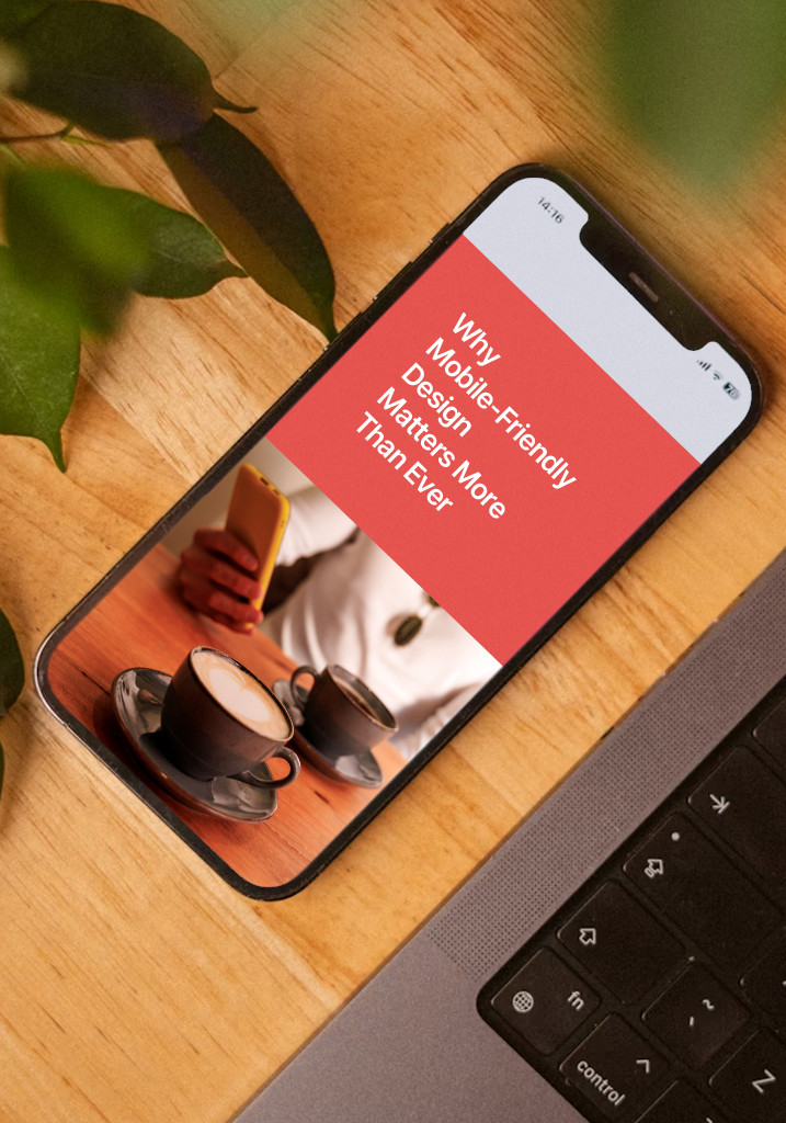
Mobile-Friendly Design Is Non-Negotiable Too
More than half your traffic comes from mobile devices. If your website doesn’t work flawlessly on phones and tablets, you’re turning away more than half your potential clients.
But mobile-friendly doesn’t just mean “make sure the desktop site also works on mobile.” It means thinking mobile from the start—ensuring your content is readable, your buttons are tappable, your forms are easy to complete, and your most important information is immediately visible on smaller screens.
The best approach? Plan the mobile experience first, then expand for desktop. Why? Mobile forces you to prioritize. You can’t cram everything onto a small screen, so you decide what truly matters. That discipline makes your website better on every device.
Balance Beauty and Function
Your website needs to look professional, but design should always serve strategy. Beautiful design that confuses visitors is just expensive decoration. Simple design that converts is invaluable.
The goal is finding the sweet spot where aesthetics and functionality work together—where your website looks credible and professional while making it easy for visitors to understand your value and take action.
The Technical Foundations You Can't Ignore
Ignore these technical foundations and your brilliant strategy will convert nobody.
Website Structure That Makes Sense
Your site structure should be logical and hierarchical. Important pages shouldn’t be buried four levels deep. Everything should be accessible within two or three clicks of the homepage.
Good structure helps both visitors and search engines understand what you do and how your services relate to each other. It’s not sexy, but it’s essential.
Search Engine Optimization (Without the Snake Oil)
SEO isn’t something you add later—it’s baked into your structure and content from the beginning.
Do keyword research to understand how your ideal clients actually search. Create a logical site structure. Target a mix of commercial and informational keywords. Handle the technical basics (page titles, meta descriptions, header tags, image alt text, URL structure).
The goal isn’t to trick Google. It’s to make sure people searching for exactly what you offer can find you.
Choose the Right Platform
WordPress, Squarespace—each has pros and cons. Consider your technical comfort level, budget, customization needs, and long-term maintenance requirements.
There’s no universally “best” platform. There’s only the best platform for your specific situation and skill level.
Analytics and Tracking (Or You’re Just Guessing)
You cannot improve what you don’t measure. Before you launch, set up proper analytics tracking. Not just Google Analytics, but conversion tracking that tells you what’s actually working.
What pages do people visit before they contact you? Where do they drop off? Which content keeps them engaged? These answers should inform every decision you make.
Accessibility Means More Clients
About 15% of the global population has some form of disability. If your website isn’t accessible, you’re excluding 15% of your market.
Basic accessibility isn’t complicated: You want to use sufficient colour contrast. Include alt text on images. Make sure your site is keyboard-navigable. Use clear language. Structure content with proper headings. Ensure forms have clear labels.
Planning for accessibility from the start is easier than retrofitting it later.
The Biggest Mistakes That Kill Website Effectiveness
Let me save you time and money by calling out the mistakes we see most often.
Mistake #1: Building Like It’s 2010
Service professionals spend months building a website, launch it, then don’t touch it for three years. Your website should never be “done.” It’s not a project; it’s a platform that evolves with your business.
The solution isn’t to skip planning—it’s to plan for iteration. Launch with your core pages solid, then refine continuously based on real data and feedback.
Mistake #2: The “Everything for Everyone” Trap
“But if I’m too specific, I’ll lose potential clients!” This fear kills more conversions than almost anything else. When you try to speak to everyone, you connect with no one.
Specificity attracts. Vagueness repels. The clients you’re worried about losing through specificity? You were already losing them through vagueness.
Mistake #3: Treating Your Website Like a Brochure
Your website is not a passive information repository. It’s an active sales tool that should constantly qualify leads and drive conversions.
Every page should have a purpose in your conversion funnel. If a page exists just to exist, it’s dead weight.
Mistake #4: Hiding Behind Professional Distance
Service businesses are relationship businesses. People hire professionals they like and trust. Yet so many websites sound like they were written by corporate robots.
Your website should sound like you actually sound. Not unprofessional, but human. Use contractions. Ask questions. Share opinions. Let your personality come through.
Mistake #5: Launching Without Testing
Before you launch, test your conversion path like you’re a confused prospect at 11 PM on their phone. Can you understand what the business does in under 10 seconds? Can you figure out if you’re the right fit? Can you easily schedule a call?
Better yet, test with actual people who don’t know your business. Watch them navigate. See where they get confused.
Your Website Planning Action Plan
Ready to plan a website that actually works? Here’s your roadmap.
Before You Start: Gather What You Need
Before you hire a designer or start building, gather everything you’ll need. This includes your brand assets, existing content, client testimonials, case study information, service descriptions, credentials and certifications, high-quality photos, and any competitive research you’ve done.
Having everything ready before you start saves time, money, and frustration later.
Weeks 1-2: Strategy Foundation
Define your target audience with painful specificity. Map the conversion journey. Clarify your differentiation. List the beliefs required for conversion. Audit your existing materials. Create your site map and write your value propositions.
Weeks 3-4: Content Development
Draft core page content for your homepage, service pages, about page, and contact page. Focus on clarity and conversion, not perfection. Gather proof elements (testimonials, case studies, credentials). Develop your key messages.
Week 5: Design Planning
Choose your design approach (template, designer, or custom). Create a visual hierarchy plan. Select your visual elements (photography, colours, typography). Plan for mobile first. Ensure your design decisions support conversion, not just aesthetics.
Week 6: Technical Setup
Choose your platform. Plan your URL structure. Set up essential tools (hosting, email, analytics, heat mapping, forms). Create a security plan (SSL, backups, updates). Get the technical foundation right before you build.
Weeks 7-8: Build and Implement
Build core pages first (homepage, service pages, about, contact). Implement conversion elements (forms, calls-to-action, scheduling). Add proof and credibility strategically. Optimize for speed (compress images, minimize code, test load times).
Week 9: Test Everything
Test on multiple devices and browsers. Walk through conversion paths as if you’re a prospect. Get outside feedback from people who don’t know your business. Check all technical elements (SEO basics, analytics, forms, speed, mobile responsiveness, accessibility).
Week 10: Launch and Monitor
Set up monitoring to track traffic, conversions, and engagement. Create a maintenance schedule. Plan Phase 2 (what you’ll add or test next). Collect feedback and let real behaviour inform optimization.
Months 2-6: Optimize and Improve
Review analytics monthly. A/B test key elements (headlines, calls-to-action, forms). Add content strategically. Refine based on sales conversations. Keep everything current and relevant.
Feeling overwhelmed by all of this? That’s completely normal. Website planning requires strategic thinking, content development, design sensibility, and technical know-how—and not everyone has the time or inclination to do it all themselves. At Agenda Marketing, we help service professionals plan and build websites that actually work for their business. Whether you need help with the entire process or just want strategic guidance on specific pieces, we’re here.
The Long Game: Website Planning Never Really Ends
Here’s something nobody tells you: Website planning isn’t a project with an end date. It’s an ongoing strategic process that evolves with your business.
Your best clients will change. Your services will evolve. Your market will shift. Your website needs to evolve too.
The service professionals who get the best ROI from their websites aren’t the ones who launch once and forget it. They’re the ones who treat their website as a living system that gets continuously refined based on real data and feedback.
Think of your website like a conversation you’re having with thousands of potential clients. As you learn more about what they need and what persuades them, you refine that conversation. You get better at addressing concerns. You find clearer ways to explain concepts. You discover which stories resonate most.
The website you launch in Week 10 will be good. The website you have 18 months later, after continuous optimization based on real user behaviour, will be exceptional.
Your ideal clients are out there searching for exactly what you offer. Your website’s job is to help them find you, understand what makes you different, and feel confident enough to reach out. Do that well, and your website becomes your best business development tool—working 24/7 to attract and convert the clients you’re meant to serve.
Now stop overthinking it and start planning.